

Christie’s Candies & Mints
Responsive Website Case Study
My task was to design a responsive website that highlights the business’ story, products, allows users to view stock, products to their cart, and allows online checkout.
I chose this store for the project because it has been around for over 50 years and does not have an online presence.
Project Overview
Background
Design a responsive website a responsive website that highlights the business’ story, highlights products, allows users to view stock, add products to their cart, and allows online checkout.
Problem
How can we expand the store’s visibility to increase sales in person, via phone, and online?
KPIs
Browse in-stock candy
Add items to cart
Choose shipping address or pickup in store
Pay online
Scope
Product Design + UI
Timeline
8 weeks, 10 hours/week
Client
Christie’s Candies & Mints
Design Lab Course
Research
Before designing the website, I began by researching local competitors, both in store and online, to explore what makes Christie’s unique in the market and help distinguish them from the competitors. I also studied the online presence of some some larger nation-wide candy companies to research their UI design.
Because my client has many regular customers, I was able to work with Christie’s to assess their existing market. This lead to the 4 main customer personas that purchase either in-store or through call-in orders. I made the decision to use these 4 personas throughout the design process instead of creating a Primary Persona because purchasing candy is something that is open to anyone.
Competitive Research
Research Ramp-Up

Define
From my research, I found 2 problems:
Potential consumers may not be familiar with the store, products, or location.
There are many other competitors, locally or online, where customers could purchase candy.
This lead me to think about how I could make it easier for users to learn about Christie’s Candies & Mints and visit the store either in-person or online. I came to the conclusion that the solution is to build a responsive website that features the history of the store, products with clear descriptions and stock information, and other essential information such as hours, address, and contact information.
To help define how users would interact with this website, I started by creating the main task flow where users could find and purchase candy online. This task flow was then used as the basis for the user flow to visualize how a user could navigate Christie’s Candies & Mints. This helped determine what pages were needed as users took different paths and to gather data on what they would do on the webpage.
The sitemap was created based upon the flows and helped to conceptualize how users would navigate the website and how material could be arranged together.
User Flow
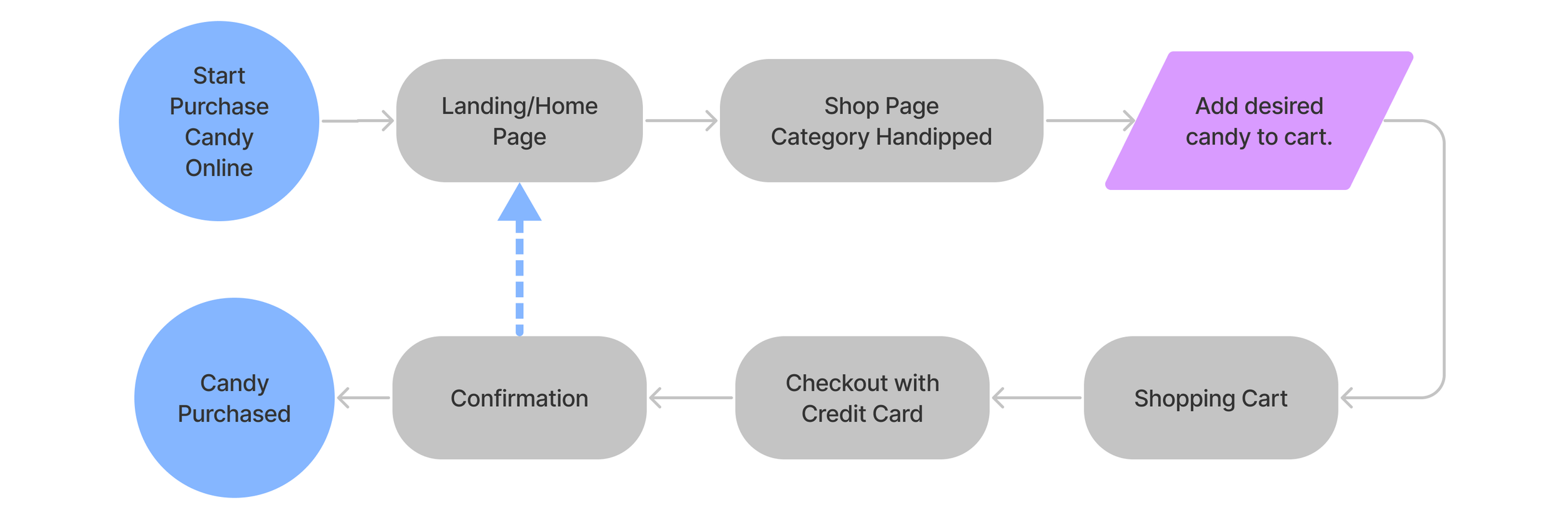
User Flow
Site Map
Design
Using the research and defining artifacts, I sketched some layouts for the sitemap pages. These are the screens that a user would interact with when trying to find information about Christie’s Candies products, location, and history. The key page is the landing/homepage because this is where users would start their search of Christie’s Candies webpage.
Using the sketches as a starting point, I built out Low-Fi Wireframes for key screens to help inform the final layout and to receive user feedback based on the task flow of purchasing candy online.
Since this is a company that was established over 50 years ago, a logo with specific colors was already in place and I included that in the branding style guide. It was also important to create a UI toolkit with their color palette and other design components used on this website.
All of the above was used to bring together the Mid-Fi Wireframes that would eventually be used for the prototype testing.
Sketches
Low-Fi Wireframes: Desktop
Low-Fi Wireframes: Mobile
Brand Identity
UI Toolkit

Mid-Fi Wireframes: Desktop
Mid-Fi Wireframes: Mobile
Testing
I did in person testing to test the layout and navigation of the responsive website using the Figma Prototype presentation. Each user ran through the main task flow while I observed and then asked them pertinent questions.
The testing helped to clarify how users would potentially interact with the website and helped me identify some elements that were missing in the Mid-Fi Wireframe.
After some changes, I did semi-moderated remote user testing on the High-Fi prototype with 12 users. This round of testing helped polish the look of the website.
Wireframe Hi-Fi: Desktop
Wireframe Hi-Fi: Mobile


Final Thoughts
The purpose of the responsive website is to increase the customer base and to get potential customers to purchase candy in-store, via phone, or online. The responsive design allows potential users to interact easily on a desktop computer or through a phone or other mobile devices.
I learned frequent and good communication with the client is important to keep the project manageable, and setting concrete and specific deliverables helps to reduce scope creep.